数据可视化(Python)

鸢尾花(Iris)数据集如何利用pandas, matplotlibseaborn库进行可视化分析。

1
2
3
4
5
6
7
8
9
10
11
12
13
14
15
# First, we'll import pandas, a data processing and CSV file I/O library
import pandas as pd
# We'll also import seaborn, a Python graphing library
import warnings # current version of seaborn generates a bunch of warnings that we'll ignore
import seaborn as sns
import matplotlib.pyplot as plt

warnings.filterwarnings("ignore")
sns.set(style="white", color_codes=True)

# Next, we'll load the Iris flower dataset, which is in the "../input/" directory
iris = pd.read_csv("../input/Iris.csv") # the iris dataset is now a Pandas DataFrame

# Let's see what's in the iris data - Jupyter notebooks print the result of the last thing you do
iris.head()

让我们看一下数据,结果输出为:

1
2
3
4
5
6
   Id  SepalLengthCm  SepalWidthCm  PetalLengthCm  PetalWidthCm      Species(物种)
0 1 5.1 3.5 1.4 0.2 Iris-setosa
1 2 4.9 3.0 1.4 0.2 Iris-setosa
2 3 4.7 3.2 1.3 0.2 Iris-setosa
3 4 4.6 3.1 1.5 0.2 Iris-setosa
4 5 5.0 3.6 1.4 0.2 Iris-setosa

每个物种有多少个实例:

1
2
# Let's see how many examples we have of each species
iris["Species"].value_counts()

结果输出为:

1
2
3
4
Iris-setosa        50
Iris-versicolor 50
Iris-virginica 50
Name: Species, dtype: int64

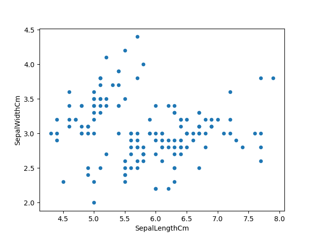
我使用pandas数据帧的.plot()绘图能力来制作鸢尾花(Iris)特征的散点图。

1
2
3
# The first way we can plot things is using the .plot extension from Pandas dataframes
# We'll use this to make a scatterplot of the Iris features.
iris.plot(kind="scatter", x="SepalLengthCm", y="SepalWidthCm")

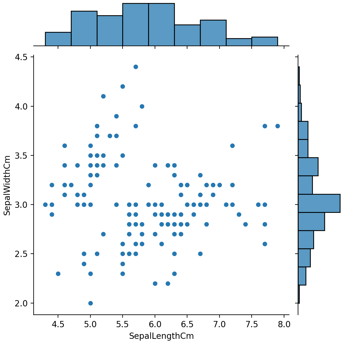
我们还可以使用seaborn库来制作类似的散点图,Seaborn组合图在同一图中显示双变量散点图和单变量直方图:

1
2
3
# We can also use the seaborn library to make a similar plot
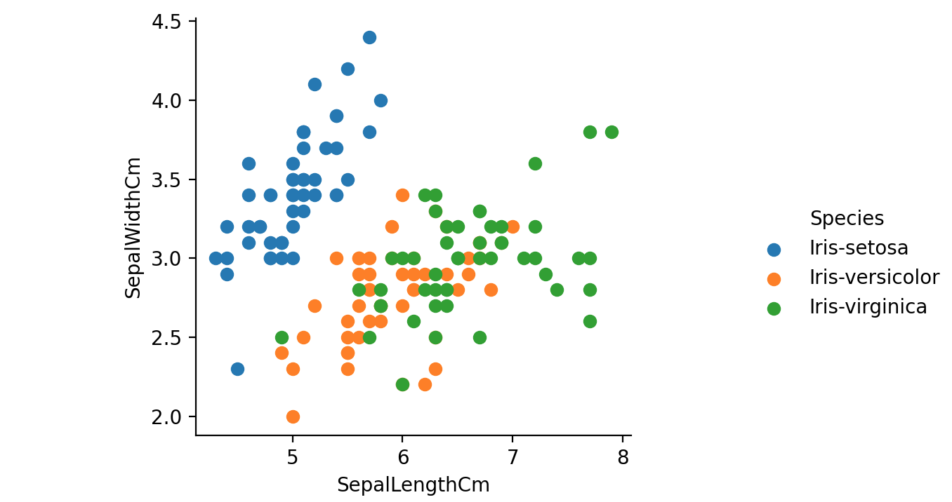
# A seaborn jointplot shows bivariate scatterplots and univariate histograms in the same figure
sns.jointplot(x="SepalLengthCm", y="SepalWidthCm", data=iris, size=5)

上图中缺少每种植物的物种信息。我们将使用seabornFacetGrid按物种为散点图着色:

1
2
3
# One piece of information missing in the plots above is what species each plant is
# We'll use seaborn's FacetGrid to color the scatterplot by species
sns.FacetGrid(iris, hue="Species", size=5).map(plt.scatter, "SepalLengthCm", "SepalWidthCm").add_legend()

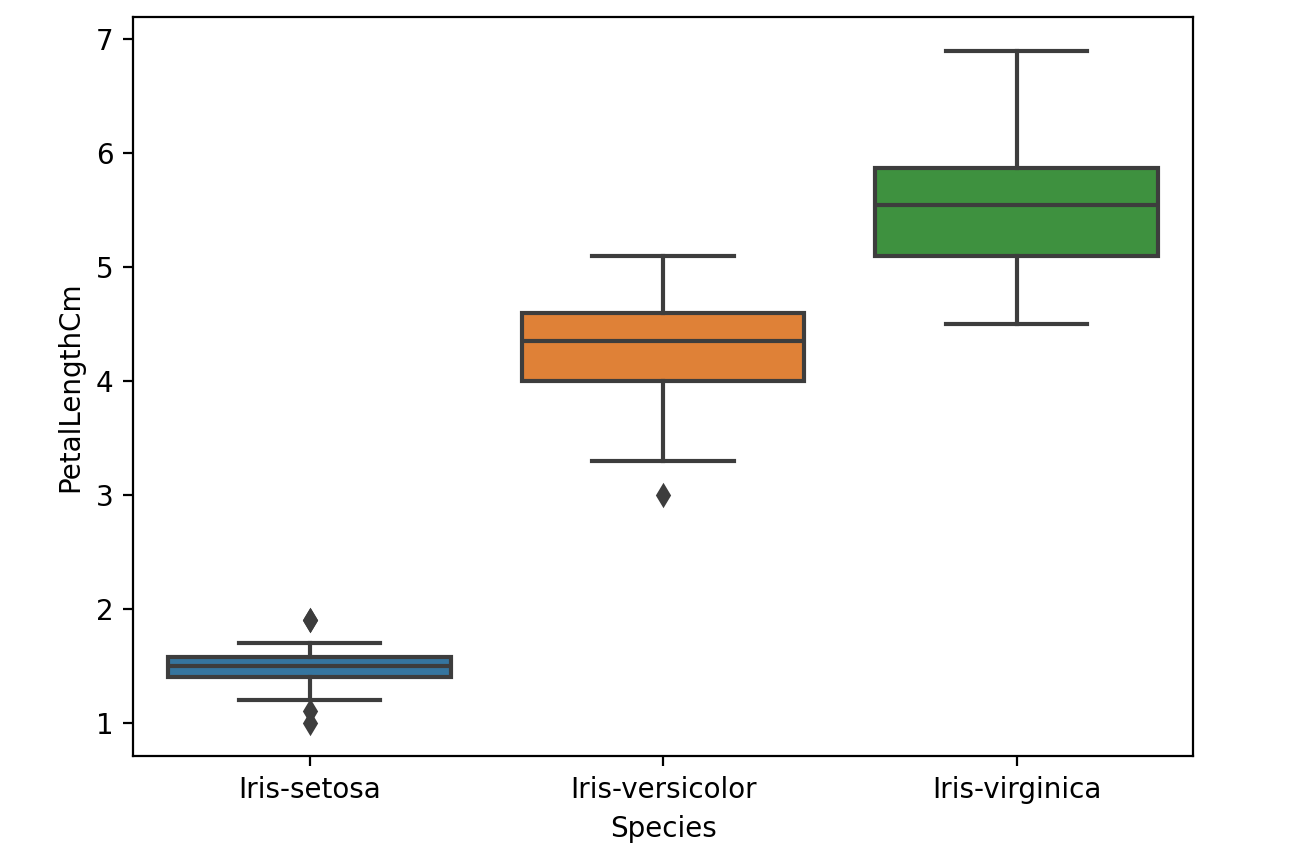
我们可以通过箱线图查看Seaborn中的单个特征。

1
2
# We can look at an individual feature in Seaborn through a boxplot
sns.boxplot(x="Species", y="PetalLengthCm", data=iris)

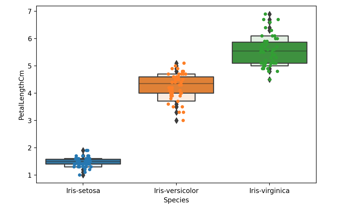
我们扩展该图的一种方法是在上面添加一层单独的点。我们将使用jitter=True以便所有点都不会落在单个垂直线上。

1
2
3
4
# One way we can extend this plot is adding a layer of individual points on top of
# it through Seaborn's striplot
ax = sns.boxplot(x="Species", y="PetalLengthCm", data=iris)
ax = sns.stripplot(x="Species", y="PetalLengthCm", data=iris, jitter=True, edgecolor="gray")

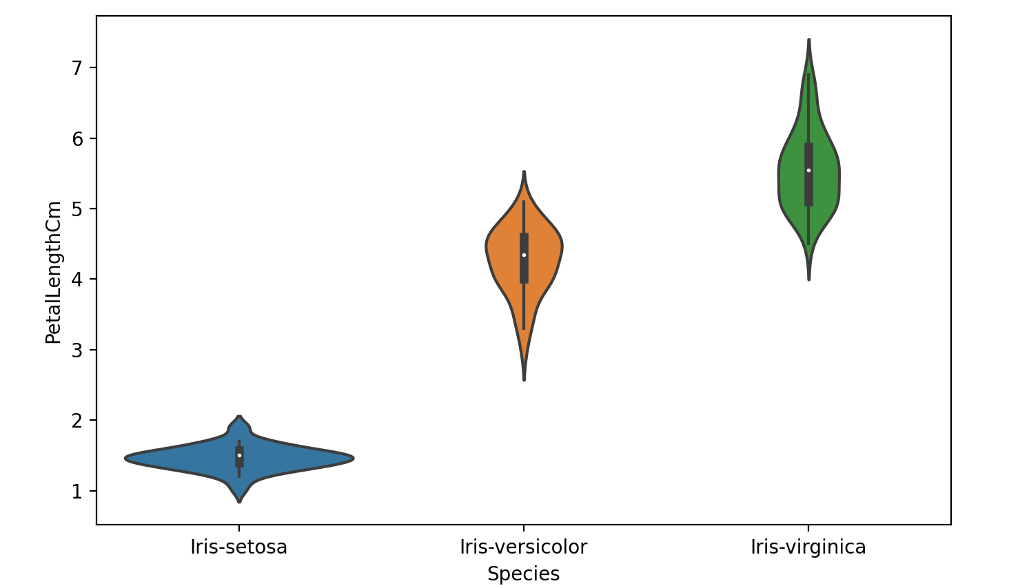
小提琴图结合了前两个图的优点并简化了它们在小提琴图中,数据的密集区域更厚,稀疏区域更薄。

1
2
3
# A violin plot combines the benefits of the previous two plots and simplifies them
# Denser regions of the data are fatter, and sparser thiner in a violin plot
sns.violinplot(x="Species", y="PetalLengthCm", data=iris, size=6)

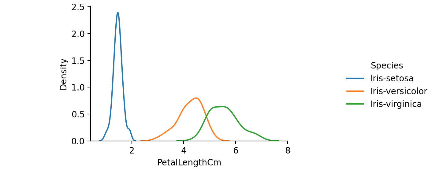
用于查看单变量关系的最后一个seaborn图是kdeplot,创建并可视化底层特征的核密度估计。

1
2
3
# A final seaborn plot useful for looking at univariate relations is the kdeplot,
# which creates and visualizes a kernel density estimate of the underlying feature
sns.FacetGrid(iris, hue="Species", size=6).map(sns.kdeplot, "PetalLengthCm").add_legend()

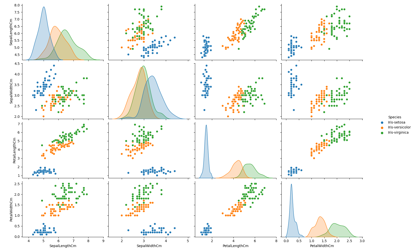
另一个有用的seaborn图是pairplot,它显示了每对特征之间的二元关系。从配对图中,我们可以看到,在所有特征组合中,Iris-setosa物种都与其他两种物种分离。

1
2
3
4
5
6
# Another useful seaborn plot is the pairplot, which shows the bivariate relation
# between each pair of features
#
# From the pairplot, we'll see that the Iris-setosa species is separataed from the other
# two across all feature combinations
sns.pairplot(iris.drop("Id", axis=1), hue="Species", size=3)

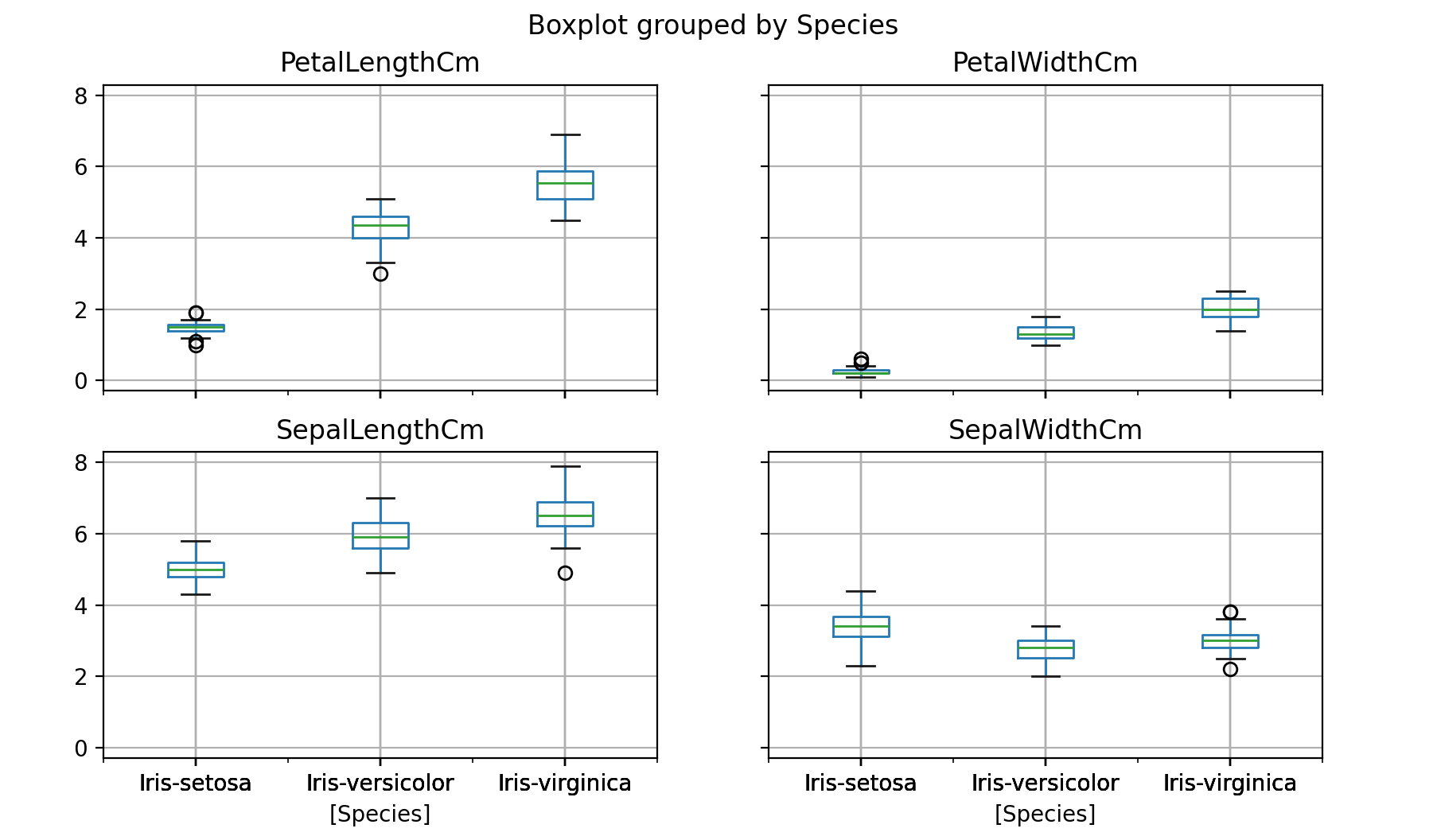
既然我们已经介绍了seaborn,让我们回顾一下我们可以用Pandas制作的一些图。我们可以用Pandas快速制作一个箱线图,按物种划分每个特征。

1
2
3
# Now that we've covered seaborn, let's go back to some of the ones we can make with Pandas
# We can quickly make a boxplot with Pandas on each feature split out by species
iris.drop("Id", axis=1).boxplot(by="Species", figsize=(12, 6))

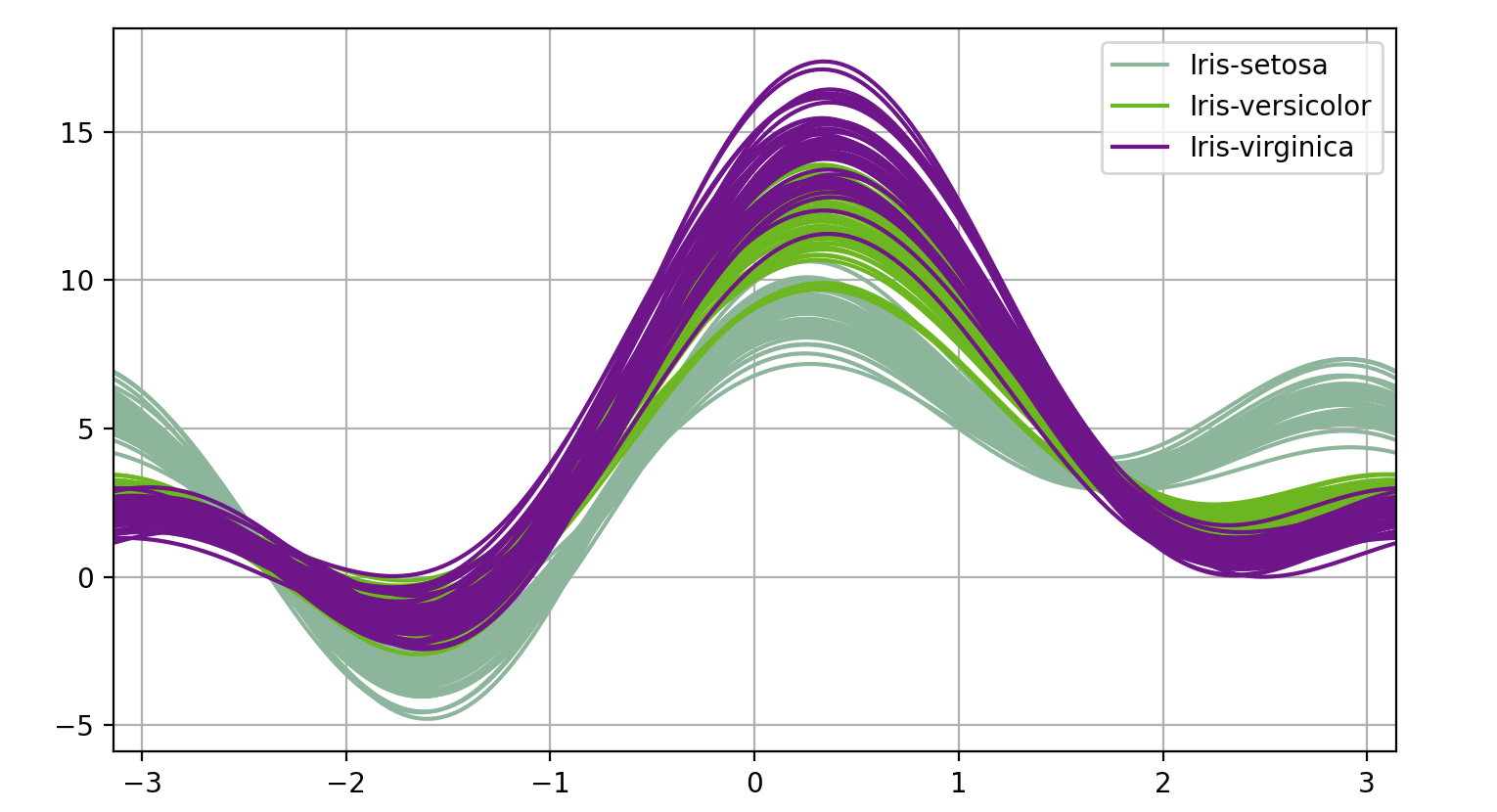
Pandas中有一个更酷更复杂的技术叫做安德鲁斯曲线。安德鲁斯曲线涉及使用样本的属性作为傅里叶级数的系数。

1
2
3
4
5
# One cool more sophisticated technique pandas has available is called Andrews Curves
# Andrews Curves involve using attributes of samples as coefficients for Fourier series
# and then plotting these
from pandas.plotting import andrews_curves
andrews_curves(iris.drop("Id", axis=1), "Species")

pandas的另一种多元可视化技术是parallel_coordinates平行坐标将每个特征绘制在单独的列上,然后绘制连接每个数据样本特征的线。

1
2
3
4
5
# Another multivariate visualization technique pandas has is parallel_coordinates
# Parallel coordinates plots each feature on a separate column & then draws lines
# connecting the features for each data sample
from pandas.plotting import parallel_coordinates
parallel_coordinates(iris.drop("Id", axis=1), "Species")

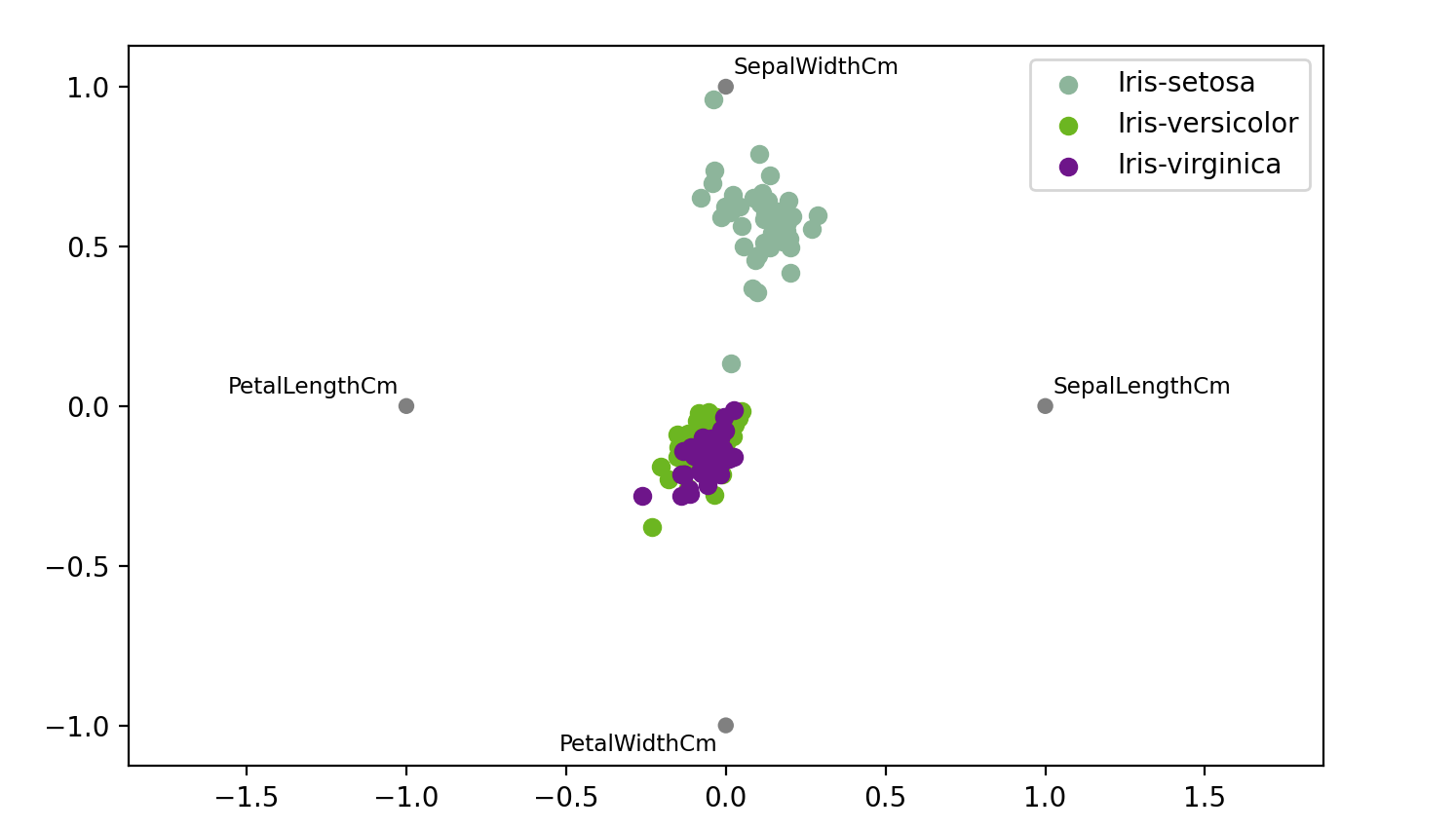
pandas的最后一项多元可视化技术是radviz。它将每个特征作为二维平面上的一个点,然后模拟将每个样本通过一个由该特征的相对值加权的弹簧连接到这些点。

1
2
3
4
5
6
# A final multivariate visualization technique pandas has is radviz
# Which puts each feature as a point on a 2D plane, and then simulates
# having each sample attached to those points through a spring weighted
# by the relative value for that feature
from pandas.plotting import radviz
radviz(iris.drop("Id", axis=1), "Species")