数据可视化(Seaborn)

如何最好地讲述数据背后的故事并不总是那么容易,因此我们将图表类型分为三大类来帮助解决这一问题。
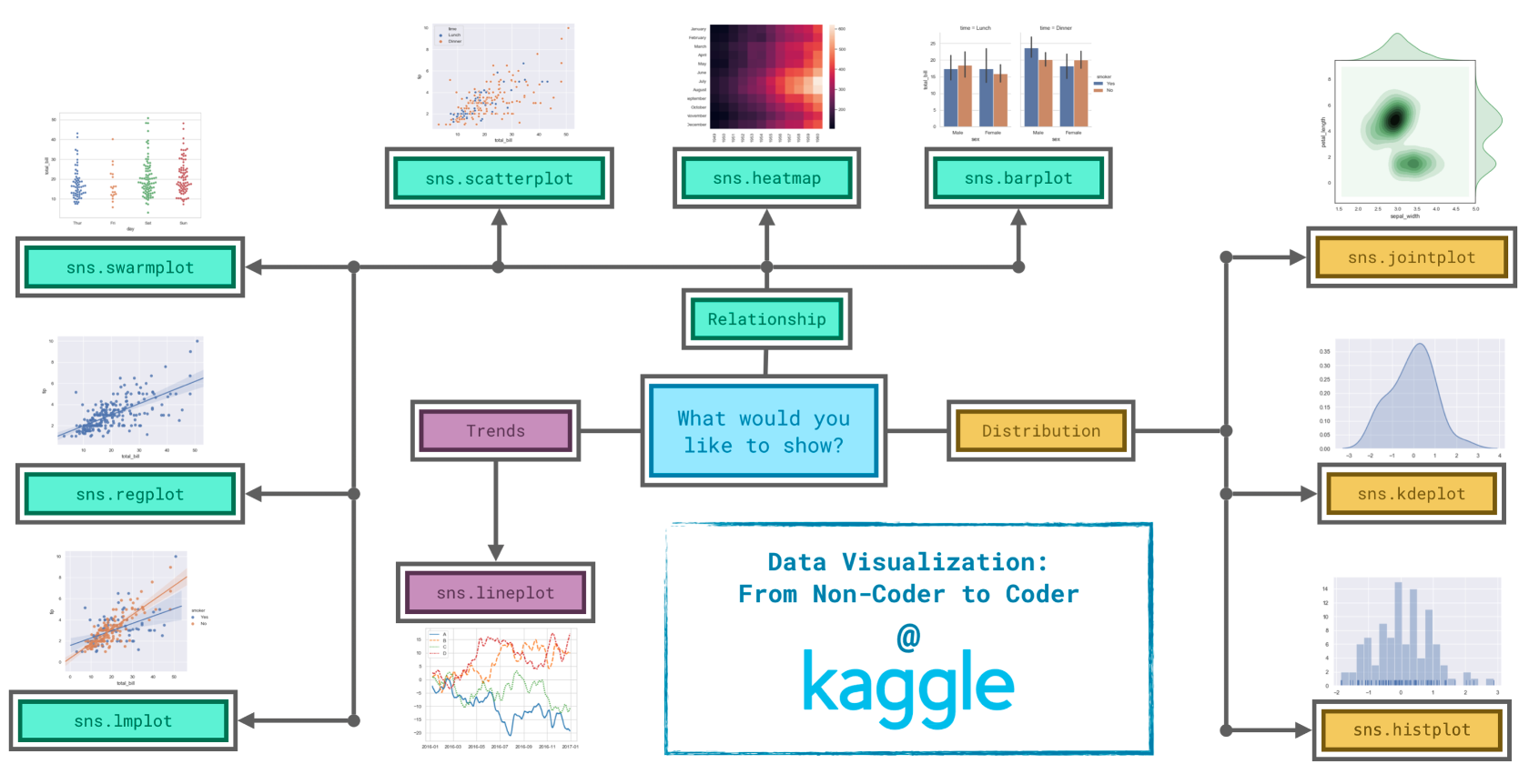
  • Trends(趋势):趋势被定义为变化的模式。
    • sns.lineplot - 折线图最能显示一段时间内的趋势,并且可以使用多条线来显示多个组中的趋势。
  • Relationship(关系):您可以使用许多不同的图表类型来了解数据中变量之间的关系。
    • sns.barplot - 条形图可用于比较不同组对应的数量。
    • sns.heatmap - 热图可用于在数字表中查找颜色编码模式。
    • sns.scatterplot - 散点图显示两个连续变量之间的关系;如果用颜色编码,我们还可以显示与第三个分类变量的关系。
    • sns.regplot - 在散点图中包含回归线可以更轻松地查看两个变量之间的任何线性关系。
    • sns.lmplot - 如果散点图包含多个颜色编码组,则此命令对于绘制多条回归线非常有用。
    • sns.swarmplot - 分类散点图显示连续变量和分类变量之间的关系。
  • Distribution(分布):我们将分布可视化以显示我们期望在变量中看到的可能值以及它们的可能性。
    • sns.histplot - 直方图显示单个数值变量的分布。
    • sns.kdeplot - KDE(或2D KDE图)显示单个数值变量(或两个数值变量)的估计平滑分布。
    • sns.jointplot - 此命令对于同时显示2D KDE图和每个单独变量的相应KDE图。
1
2
3
4
5
6
7
8
9
10
11
12
13
14
15
16
17
18
19
20
21
22
23
24
25
26
27
28
29
30
31
32
33
34
35
36
37
38
39
40
41
42
43
44
45
46
47
48
49
50
51
52
53
54
55
56
57
58
59
60
61
62
63
64
65
66
67
68
69
70
71
72
73
import pandas as pd
pd.plotting.register_matplotlib_converters()
import matplotlib.pyplot as plt
import seaborn as sns
print("Setup Complete")

# Path of the file to read
# spotify_filepath = "../input/spotify.csv"

# Read the file into a variable spotify_data
# spotify_data = pd.read_csv(spotify_filepath, index_col="Date", parse_dates=True)

# Line chart
# plt.figure(figsize=(12,6))
# sns.lineplot(data=spotify_data)

# # Path of the file to read
# fifa_filepath = 'fifa.csv'
# # Read the file into a variablefaia_data
# fifa_data = pd.read_csv(fifa_filepath, index_col='Date', parse_dates=True)
# # print(fifa_data.head())

# # Set the width and weight of the figure
# plt.figure(figsize=(16, 6))
# # Line chart showing how FIFA rankings evoloed over time
# print(list(fifa_data.columns))
# # Add title
# plt.title("FIFA ranking evoloed over time")

# sns.lineplot(data=fifa_data['ARG'])
# sns.lineplot(data=fifa_data['BRA'])
# plt.xlabel('Date')

# flight_filepath = 'flight_delays.csv'
# flight_data = pd.read_csv(flight_filepath, index_col='Month')

# plt.figure(figsize=(10, 6))
# plt.title("Average Arrival Delay for Spirit Airlines Flights, by Month")
# sns.barplot(x=flight_data.index, y=flight_data['NK'])
# plt.ylabel("Arrival delay (in minutes)")

# plt.figure(figsize=(14, 7))
# plt.title("Average Arrival Delay for Each Airline, by Month")
# sns.heatmap(flight_data, annot=True)
# plt.xlabel("Airline")

# insurance_filepath = 'insurance.csv'
# insurance_data = pd.read_csv(insurance_filepath)

# plt.figure(figsize=(10, 6))
# sns.scatterplot(x=insurance_data['bmi'], y=insurance_data['charges'])
# sns.regplot(x=insurance_data['bmi'], y=insurance_data['charges'])
# sns.scatterplot(x=insurance_data['bmi'], y=insurance_data['charges'], hue=insurance_data['smoker'])
# sns.lmplot(x='bmi', y='charges', hue='smoker', data=insurance_data)
# sns.swarmplot(x=insurance_data['smoker'], y=insurance_data['charges'])

iris_filepath = 'iris.csv'
iris_data = pd.read_csv(iris_filepath, index_col='Id')

# Change the style of the figure
sns.set_style("ticks")

plt.figure(figsize=(10, 6))
# sns.histplot(data=iris_data['Petal Length (cm)'])
# sns.kdeplot(data=iris_data['Petal Length (cm)'], shade=True)
# sns.jointplot(x=iris_data['Petal Length (cm)'], y=iris_data['Sepal Width (cm)'], kind='kde')

# plt.title('Histogram of Petal Lengths, by Species')
# sns.histplot(data=iris_data, x='Petal Length (cm)', hue='Species')
plt.title('Distribution of Petal Lengths, by Species')
sns.kdeplot(data=iris_data, x='Petal Length (cm)', hue='Species', shade=True)

plt.show()